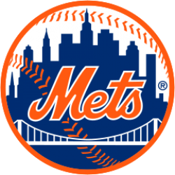
New York Mets Logo

The cap logo is identical to the logo used by the New York Giants in their final years, and is on a blue cap reminiscent of the caps worn by the Brooklyn Dodgers. In the primary logo, designed by sports cartoonist Ray Gatto, each part of the skyline has special meaning—at the left is a church spire, symbolic of Brooklyn, the borough of churches; the second building from the left is the Williamsburgh Savings Bank, the tallest building in Brooklyn; next is the Woolworth Building; after a general skyline view of midtown comes the Empire State Building; at the far right is the United Nations Building. The bridge in the center symbolizes that the Mets, by bringing National League baseball back to New York, represent all five boroughs.
With the introduction of black as an official color, an alternate team logo was created in 1999. It is identical to the original logo, but the skyline is black instead of blue and the "Mets" script is blue trimmed in orange and white instead of orange trimmed in white (the alternate black jerseys displayed the primary blue and orange logo on the left sleeves in 1998; in 1999 this was changed to the alternate black and blue logo). The logo fell into disuse after the Mets dropped the alternate black jerseys and caps in 2012.
Also in 1999, the logo received a slight alteration. The "NY" to the left of the team script was removed. No other notable changes were made.
© Symbols.com
