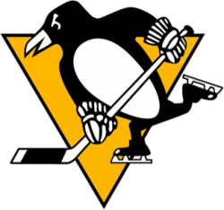
Pittsburgh Penguins Logo

The Pittsburgh Penguins are an American professional ice hockey team based in Pittsburgh, Pennsylvania, that competes in the National Hockey League (NHL). They are members of the league's Metropolitan Division of the Eastern Conference. The franchise was founded in 1967 as one of the first expansion teams during the league's original expansion from six to twelve teams. The Penguins played in the Civic Arena, also known to Pittsburgh fans as "The Igloo", from the time of their inception through the end of the 2009–10 season. They moved into their new arena, PPG Paints Arena, to begin the 2010–11 NHL season. They have qualified for five Stanley Cup Finals, winning the Stanley Cup four times – in 1991, 1992, 2009, and 2016.
With the exception of the 1992–2002 period, the Penguins have used a variation of the "skating penguin" logo since the team's inception. For their inaugural season, the logo featured a hefty-looking skating penguin wearing a scarf, on a gold triangle inside a circle reading "Pittsburgh Penguins." The gold triangle is a reference to the Golden Triangle in the city of Pittsburgh. Then-General Manager Jack Riley felt the team's name and logo were ridiculous, and refused to have either appear on the team's uniforms, which featured only the word "PITTSBURGH" diagonally. A refined version of the logo appeared on a redesigned uniform in the second season, which removed the scarf and gave the penguin a sleeker, "meaner" look. The circle encompassing the logo was removed mid-season in 1971–72.
The team's colors were originally powder blue, navy blue and white. The powder blue was changed to royal blue in 1973, but returned in 1977 when navy became the predominant uniform color. The team adopted the current black and gold color scheme in January 1980 (the announcement was made at halftime of Super Bowl XIV) to unify the colors of the city's professional sports teams, although like the Pittsburgh Pirates and Steelers, the shade of gold more closely resembled yellow. The change was not without controversy, as the Boston Bruins protested by claiming to own the rights to the black and gold colors. However the Penguins cited the colors worn by the now-defunct NHL team Pittsburgh Pirates in the 1920s, as well as black and gold being the official colors of the City of Pittsburgh and its namesake, thus were able to secure permission to use the black and gold colors. The NHL's Pittsburgh Pirates used old Pittsburgh Police uniforms, hence beginning the black and gold sports tradition in the city.
This would remain unchanged until the 1992–93 season, when the team unveiled new uniforms and a new logo, made by Pittsburgh visual communications agency Vance Wright Adams. The logo featured a modern-looking, streamlined penguin. Although the "Robo-Penguin" logo survived in various forms for 15 years, it received mixed responses from fans and was never as widely accepted as the "skating penguin" logo. Longtime KDKA anchor Bill Burns even went as far as calling the penguin in the logo "a pigeon."
© Symbols.com
