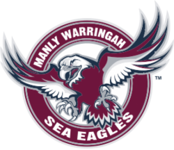
Manly Warringah Sea Eagles Logo

From the 1980s, Manly-Warringah would go on to use perhaps their most famous of logos used in what is regarded as their most successful years up until the creation of the new competition.
In conjunction with the new competition the National Rugby League, Manly-Warringah would change their logo in 1998. A new stylised sea eagle appeared under the 'Sea Eagles' banner, much more fierce and aggressive than its predecessor. It featured predominantly maroon, white, yellow and blue to symbolise the connection the club had with its major sponsor at the time Pepsi. This logo would not last however when the ill fated merger with North Sydney Bears in 2000 saw them take on the Northern Eagles moniker instead.
Upon their return in 2003, Manly opted to revert to the previous logo but tweaked it slightly to focus on the sea eagle itself and include Warringah in the club's name again. They also returned to their original colours however a darker shade of maroon and white, a symbol of their roots steming back from 1947. This logo has been in use since then.
The Sea Eagles have donned commemorative logos every decade since their 50th in 1996 and 60th in 2006 to mark their respective anniversaries of inclusion in the competition. In 2016 Manly-Warringah would unveiled a new logo to celebrate its 70th Year Anniversary. The logo bares homage to that of the one dating back from the 1960s, one of the first worn by the proud club.
© Symbols.com
